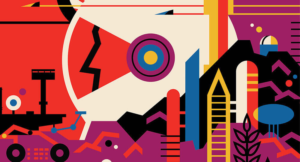
Vivid Color Palettes
Remember the days when the web was all about white, off-white, cream, and snow?
Yeah, the trend has moved on from that.
In 2020 we are going to see a resurgence of vivid, striking color palettes that is almost reminiscent of the 70s and, dare we say it, the early 90s as well. Many pieces of designs are popping with eye-catching mixes of purples, blues, and pinks.

This trend not only encompasses visuals of all types, but also 3-D logo designs and typography, drawing the eye and lighting up the imagination.
3-D is proving especially important in logo design trends, giving your brand a new look with just a few design alterations.
Deep Impact Typography
Typography has always been important in graphic design, but for 2019 we are seeing an upsurge in importance, with typography becoming a key element in many design forms.
Not only that, but it’s often typography turned up to eleven, so to speak. With large, bold typefaces and often fluidly moving text, using typography cleverly in logos and graphics in creative ways guarantees audience attraction.
We’re seeing more combinations of different typefaces, weights, orientations, and balances — a perfect amalgamation for a year that, so far, has been a pretty mixed bag.
Artful Randomization
The hand-done look has been a hot trend for a few years now, and doesn’t seem to be going away anytime soon. Piggybacking on that look, we see a new trend towards artful “mistakes”: spots, drops, rips, sprays, and elements that just look slightly out of place or off kilter to add depth to a graphic design, logo design or website image.
What this trend amounts to is a randomization of aesthetics that renders each piece truly unique. It also often leads to an unpredictability which can be fascinating to the viewer, meaning they invest more time into the graphic design.
For marketers and branding specialists, this trend is an unexpected and a slightly random blessing.
Living Coral: The Pantone Color of the Year
Coral tones have been enjoying a resurgence over the last few years, but we can expect the color to have even more significance among graphic design choices this year. Pantone has selected “Living Coral” as its Pantone Color of the Year.
This trend not only encompasses visuals of all types, but also 3-D logo designs and typography, drawing the eye and lighting up the imagination.
3-D is proving especially important in logo design trends, giving your brand a new look with just a few design alterations.
Deep Impact Typography
Typography has always been important in graphic design, but for 2019 we are seeing an upsurge in importance, with typography becoming a key element in many design forms.
Not only that, but it’s often typography turned up to eleven, so to speak. With large, bold typefaces and often fluidly moving text, using typography cleverly in logos and graphics in creative ways guarantees audience attraction.
We’re seeing more combinations of different typefaces, weights, orientations, and balances — a perfect amalgamation for a year that, so far, has been a pretty mixed bag.
Artful Randomization
The hand-done look has been a hot trend for a few years now, and doesn’t seem to be going away anytime soon. Piggybacking on that look, we see a new trend towards artful “mistakes”: spots, drops, rips, sprays, and elements that just look slightly out of place or off kilter to add depth to a graphic design, logo design or website image.
What this trend amounts to is a randomization of aesthetics that renders each piece truly unique. It also often leads to an unpredictability which can be fascinating to the viewer, meaning they invest more time into the graphic design.
For marketers and branding specialists, this trend is an unexpected and a slightly random blessing. Living Coral: The Pantone Color of the Year
Coral tones have been enjoying a resurgence over the last few years, but we can expect the color to have even more significance among graphic design choices this year. Pantone has selected “Living Coral” as its Pantone Color of the Year.
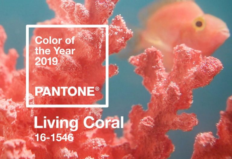
Pantone’s choices typically see a lot of use throughout the year, as Pantone is something of a style maker. So we can definitely anticipate the shade to be putting in a showing in all types of graphic visuals, whether in print or online.
Pantone itself describes Living Coral as an “energetic and life-affirming coral hue with a golden undertone that energizes and enlivens with a softer edge.” It’s referred to as “vibrant yet mellow,” and is said to symbolize our “innate need for optimism and joyful pursuits.”
So for a year that, thus far, seems centered on bright, bold, and big in terms of graphic design trends, a color that liveliness and playful expression seems absolutely on the mark.
Following the Leader
While jumping on a bandwagon isn’t always the best thing to do with regards to branding and visuals, these five trends listed above are easily open to adaptation.
So for a marketer or a branding expert looking to create visuals that are trendy and yet unique, trends like these are the perfect tool.
Author bio
A graphic designer by profession, Carol Alison also work as a freelancer on the side by writing about graphic design, branding and visual designs. Her favorite tools are Illustrator and Photoshop but she’s dabbled with Inkscape and GIMP as well.